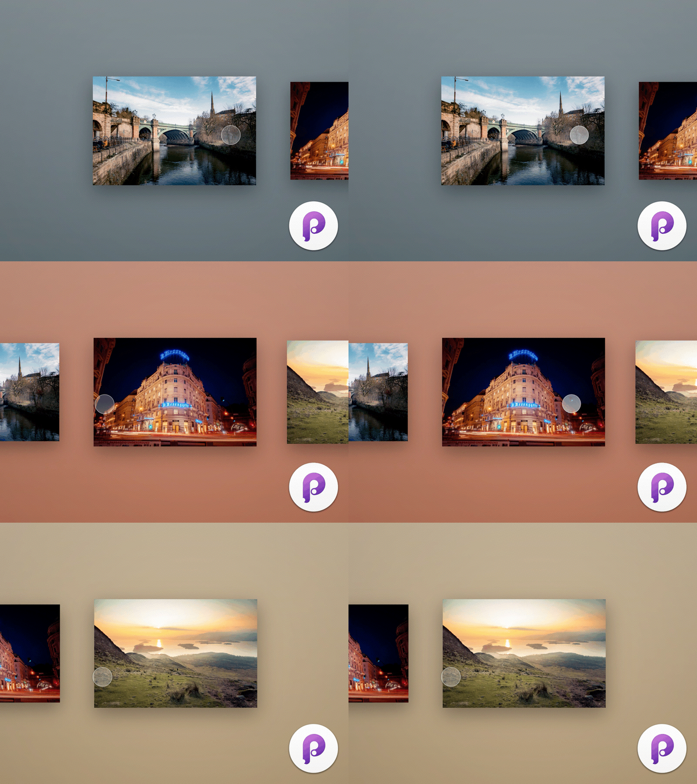
Twitter Image Lightbox
Hello Dribbble,
It's been ages, again... I'm not even surprised that I haven't posted in a while, but I felt like doing something for you this weekend. Principle 3 has been released recently with a lot of new features. I've also seen @Dann Petty 's review on Twitter's new iOS design and decided to do this small animation.
Now you're able to change the fill color with drivers, so you can easily do what Twitter does when you're viewing multiple images. It picks the dominant color from each image and uses it as a background color. Before the update you had to use a different colored layer for every image, which wasn't the easiest thing to do. Apart from that there are a lot of new things in the update, so make sure to check it out!
I've attached the .prd file in case you're interested. What do you like the most about the Principe 3 update?
Cheers,
Bence
You can follow me on:
Twitter | Instagram
PS.: These images were taken by me in Glasgow and Rome! Those cities are amazing!
