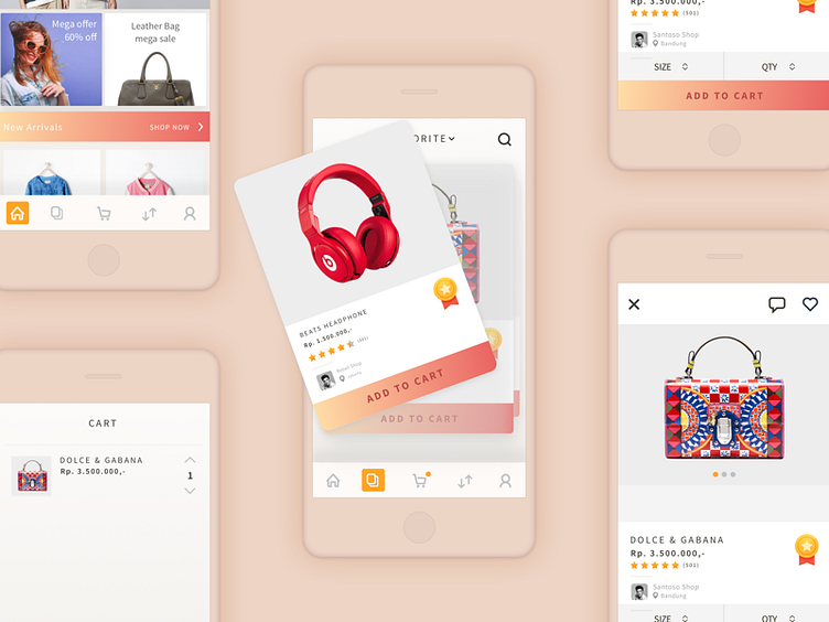
Oranjimart Case Study
I'm doing research that comes from my own assumptions. How to make window shoppers come to a shopping app and will buy items that are not a priority for him. So I was thinking how to combine the concept of a tinder. Tinder is a dating search app with the right swipe scheme for the likes and swipe left to dislike. There is some analysis why this swipe scheme is possible applied to e-commerce application oranjimart.
- Keep Things Simple Simple is one of the most common virtues of a good UX design, but Tinder has brought this concept to a more extreme area. Since the whole scheme on the tinder is a swipe. It is suitable for user window shoppers who just want to see the product only.
- Reflect on Real Human Behaviors Tinder reflect human habits, when someone likes with others, will certainly start from his physical form (photo) → just after seeing his photo and if interested then will invite a chat. Therefore the photo on the tinder is made so large that the user can clearly see the person he is going to date. As well as e commerce. The user habits when shopping is certainly a first look at the product. Whether it matches the user's wishes or not. Big photo and obviously can make the trust of the user increase so as to make the user chance for checkout bigger.
Of course this is just a concept and not yet validated whether this concept can make goals achieved or not.
