Daily UI #003 - Geocaching
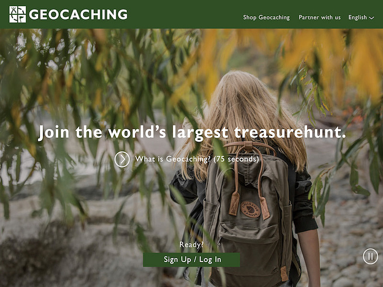
I find the process of applying for a job is an opportunity for a project for my portfolio! I took the Dialy challenge as a reason to change around the CTA's on Geocaching's landing page.
I applied to Geocaching HQ for a UX position where they needed some help on their website. They're close to what they're trying to achieve. It's an amazing experience to go Geocaching and if you haven't done it, do it! www.geocaching.com
Here, I took their landing page before signing in. They have a good video tutorial of how they work but what I did was rearrange their CTA's to encourage the user to sign up. Right now, they have a half shown signup box below. This page is adaptive and full bleed. The signup below initiates excitement and gets the user ready to start Geocaching!
