Daily UI 003
003 Landing Page (above fold)
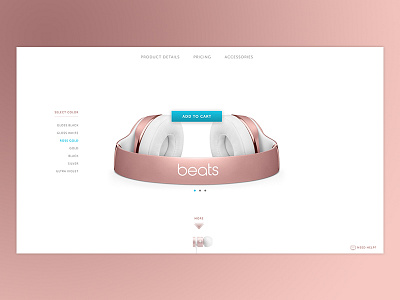
Just beginning to make my way through the daily UI challenges. I enjoy working on landing pages, but I've never been in a position to design a super minimal one, so this was the perfect opportunity. I wanted to limit the color palette and all distractions so the call-to-action was incredibly clear.
For this exercise, I thought it'd be fun to play with the branding of the page, so instead of including a logo, I chose a product image that clearly displays the brand name. I aimed to include only the information you absolutely need to make a commitment above the fold and I went with a lower-stakes CTA, as I know I'm way less hesitant to add something to my cart than to click anything that actually says "buy." Let me know what you think!

