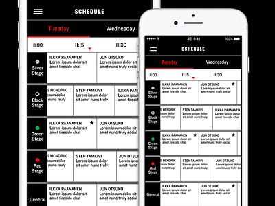
Slush 14 schedule UI
Made a schedule view for Slush 2014 mobile apps, here's the iOS version. To be somewhat consistent with other ID executions, we made a decision to use only black, white and red in UI elements which was funny and a bit challenging since usually mobile UI's are full of dimmed color tones.
Check out the current look & feel of Slush at https://slush.org.
More by Mi Ma View profile
Like
