Refined Wrapp logo
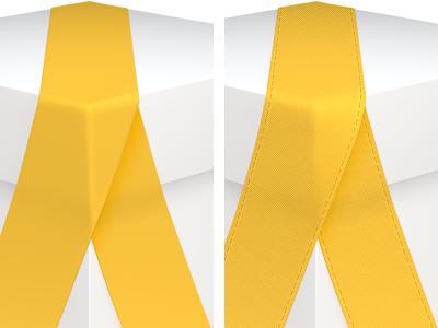
Before & After.
I got a comment that the ribbon in the Wrapp logo looked too elastic, wrapping around the corner perfectly. So I've worked on making it a little more loose and realistic, while maintaining the shape. This took some tweaking in Cinema 4D to get it right (at least I hope I got it right).
In addition to that, during the holidays I have been thinking about adding more detail to make it look even more realistic and polished. So I've added both a slight textile pattern, as well as stitching. These details become more subtle as the size decreases and are not visible in small sizes.
See the attachment for a full size comparison.
More by Max Rudberg View profile
Like

