iOS Conf SG - logo proposal 3rd iteration
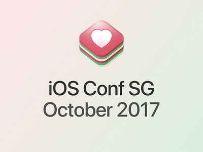
3rd iteration of Logo proposal for iOS Conf SG 2017 http://iosconf.sg/
Notes:
- Back to red/green/white colors again
- Green is still there because it provides a good (natural) contrast to the red (rose pink) color.
- Change merlion to a heart, because due to possible licensing issues with using the merlion symbol https://www.stb.gov.sg/assistance-and-licensing/resources/Pages/STB-owned-Assets-Merlion-Symbol.aspx
- Why heart? Because it's the same heart as used by launch of Apple Store Orchard Road in Singapore. Reference: http://www.tysoh.com/blog/wp-content/uploads/2017/05/applestore_sg.jpg
- There are three glyphs in the Apple store launch image: apple, heart and a red dot. Apple logo can't be used because... yeah 😏. Red dot is not used because it's a bit too vague to symbolize Singapore (could be confused with Japan 😅 and also RedDotRubyConf which is a Ruby conference). So, use heart symbol because... it signifies love? ❤️
