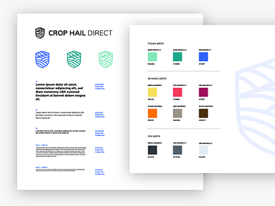
Crop Hail Direct Visual guideline - work in progress
Here´s a shot about the new project I am working on.
It´s a crop insurance for farmers in the US.
It´s so WIP that I already know some colors won´t be exactly the same, and I´ll have to increase the font size considering that my target is farmers around 65.
Which of the two solutions for the first fold of the homepage works better?
More by Marina Mangiat View profile
Like


