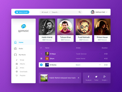
GP Music web design
In past versions the GP Music interface was in dark pallate, little bit confusing. Most of the customers can’t understand how to interact with the app. So GP decided to go user friendly interface, firstly with changing the brand color & then navigation + overall experience. Here's the final output :)
Check the full case study on Behance: https://goo.gl/rQQTm1
More by Mushfiq 🔥 View profile
Like
