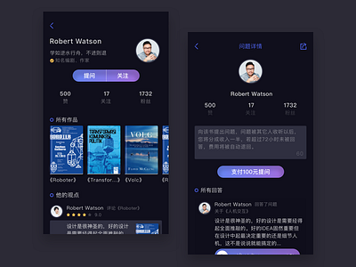
Book review community & Answer
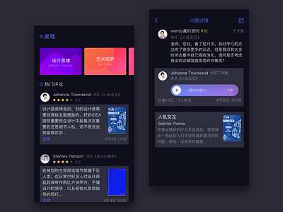


Hi mates! Let me introduce my new shot for you. This time it is the interface of a social network for readers concentrated on book swapping. I have chosen dark basic background and features a lot of diverse pictures including numerous book covers and users' avatars, so I like the style dark environment creates for all that stuff.
As you can see, I continue experimenting with interfaces and would really appreciate if I could get your opinion on some issues I am considering now, in particular:
1) What do you think about the general visual organization and presentation of the interface? Would you show your projects to your clients in this way or would you prefer classic mockups?
2) Data blocks like “Followers” and “Following” are so standard and recognizable elements for many social networks and blogs today that I've decided to optimize the space and factor out the common denominator leaving only 'ers and 'ing. What is your opinion about it? Will users be ready to understand those shortenings?