iOS Conf SG - logo proposal
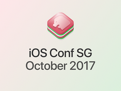
Logo proposal for iOS Conf SG 2017 http://iosconf.sg/
Few notes:
- No longer use orange like the current one. Red, green and white, instead.
- Fully inspired by the new Apple "Kit" logos, e.g. ARKit https://developer.apple.com/arkit/
- Red and white, because Singapore 🇸🇬
- Red (rose pink), green and white, because of... kuih lapis, a rather popular snack in Singapore and it means layer cake in Malay.
- Merlion, reused from my last year's proposal https://dribbble.com/shots/3035916-Experimental-logo-V2-for-iOS-Conf-SG
- Font: SF Pro Display