Pass the Peace
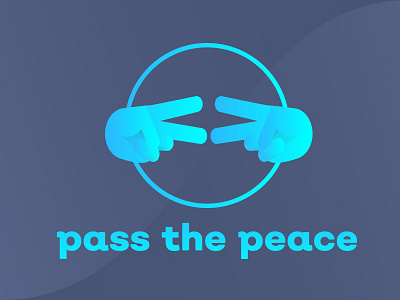
Here's the finalized iteration of the full logotype for my buddy's non-profit organization.
Considering it was my first time really messing with gradients, I'm pretty satisfied with how it turned out.
The orientation of the hands is actually a pretty cool nugget from the origin story of the nonprofit, and the circle represents the bringing of people together, a key task in that line of work.
Font family is "Nutmeg" because I know you guys are into that kind of thing. ;p