Less Clicking, More Binging
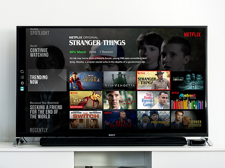
I wrote a few thoughts on how Netflix, Hulu, etc. could improve their browsing UX by utilizing a grid in their layout rather than just lists.
Read the full case study here! It even includes a nice prototype for you to try for yourself.