Brand Identity: CTS
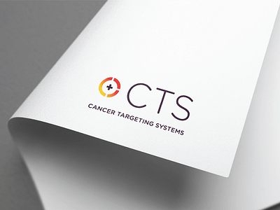
The CTS logo concept is based on the company’s unique technology - an innovative gene-based technology that combines cancer cell imaging with therapy. The Onespacemedia design team created a logo symbol that is based on a target representing the location of cancer, with the ‘plus’ symbol representing the therapeutic payload. This symbol, combined with a distinctive colour scheme and crisp typography ensures that the CTS brand will stand out in the life science and healthcare sectors.
Full Case Study at: http://www.onespacemedia.com/projects/Brand-web-design-cancer-start-up