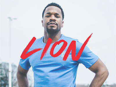
Lion Athletics Logotype
Here is a snapshot of some of the visual identity work I've been doing for a new company based out of Nova Scotia called Lion Athletics. Lion produces both supplement and lifestyle products for a young demographic and will be launching in early September.
We wanted to keep an aggressive feel for the brand but also tried to contrast that with more toned down modern elements. These include lots of additional white space, lower contrast colours, and a high depth of field with photography. Really trying to do something unique in this incredibly crowded market.
What are your thoughts on this? Lots more to come very soon with this company.
Type: Modified version of Hyperwave One by Sam Parrett.
More by Jordan Jackson View profile
Like
