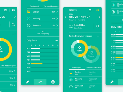
Stats Screens
Working on a task-tracking app (concept) as an experiment. This shot is a part of the stats screens where you can look back at a particular period of time.
The main screen is here: https://dribbble.com/shots/3647712-Task-Tracking-App-Concept
#What I wanted to do:
- Let users understand how they worked at a glance - Let users find problems (if any) to improve their productivity
In order to make it happen as easy and fast as possible for users, I tried 2 things in these screens:
1. Narrow down and prioritize the information they get above the fold 2. Place "the comparison button" on the top right corner, which allows users to compare two different date ranges quickly
The attachment includes the rest of the screens below the fold. Thanks for watching!
My portfolio: https://hiwanami.com/

