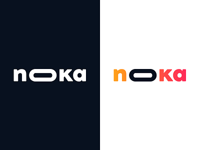
Noka Studio Final Logo
Hey guys,
So we wanted to basically show you guys our full logo that was developed across probably 6 - 8 weeks.
As anyone knows self-branding can be one of the most tedious things on the planet so not only did we switch names (such as arkade) a number of times, but also styles, forms etc.
The final logo, noka, was based on a number of things. First its a combination of our two names. We combined capitals and lower case letters because were quite indecisive in real life and love messing around. Whilst the elongated 'o' represents our vision, growing family and want to truly be a holistic design studio.
It means something to us and hopefully you guys like the logo and some that came before it, attached.
Have a great weekend!
More by Noka Studio View profile
Like


