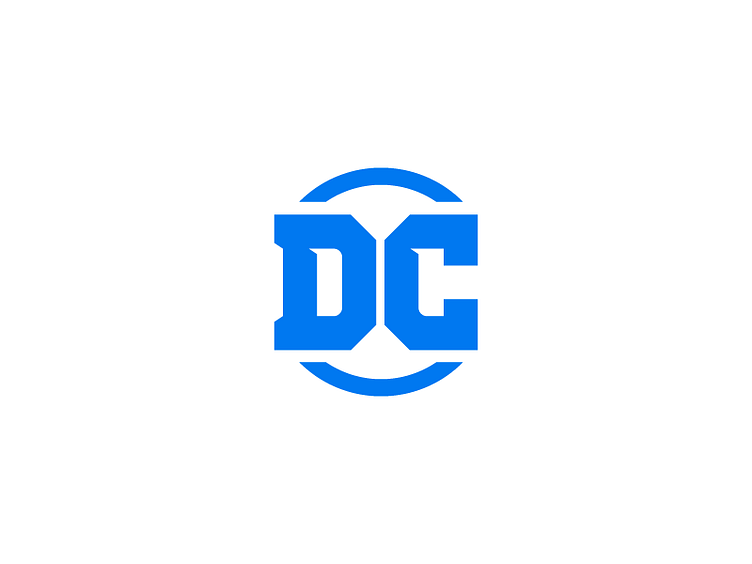
DC Logo Redesign - 1 Hour Logos - Thirty Logos Challenge Day 29
Finally finishing up with #thirtylogos Day 30! The prompt for today was to redesign an existing logo, so I decided it would be a good time to finish up my entry for the #dclogochallenge. Unlike a lot of people, I mostly like the newest DC logo. So, my take was just to tweak what I didn't like about it. In doing so, I simplified the letter forms and made them larger relative to the circle. I tried to find a way to incorporate the classic stars into the design, but wasn't able to find a way that worked well. Let me know what you think!
Follow me on Instagram! http://bit.ly/SeanCIG
More by Sean Campbell View profile
Like

