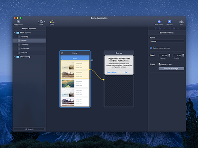
Prott for Mac - Dark UI Concept
While designing the new Prott for Mac I also experimented with a dark interface. Personally, I prefer less bright interfaces when doing visual designs because it put the focus more on the content.
If you are a Prott Pro plan user you can try the real app out starting from today! More info here: https://prottapp.com
More by Goodpatch Tokyo View profile
Like

