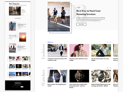
Fashion Blog Homepage Exploration
Last week I did some experimentations for men's fashion blog homepage design.
Instead of going with the "default blog" design, which includes a big hero image, then a regular list or grid of posts, I wanted to try out something completely different and harmonize the old style look&feel of the newspapers with the modern diffuse shadows.
At the top of the page I included the most important article from the past week for new and infrequent visitors, then I added the 3 latest articles for regular visitors who visit the site once a day or once in 2 days to check if there is anything new. At the bottom I added a small discovery section featuring the top 3 most popular topics.
I'd love to hear your thoughts and feedbacks. What do you think? :)
More by Daniel Korpai View profile
Like

