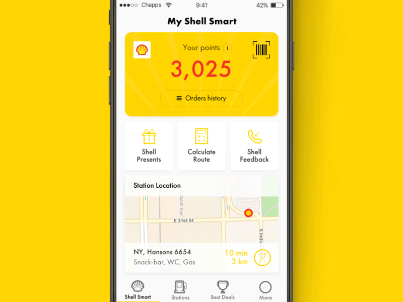
Shell App
Hi everyone!
About a year ago we’ve participated in the tender for developing the interface design for Shell Gas station.
- - - - - - - - - - - - - - - - - - - - - - - - - - - - - - - - - -
💛 – Press L if you like it.
- - - - - - - - - - - - - - - - - - - - - - - - - - - - - - - - - -
Before starting working on the project we’ve talked to a large number of car owners and we were able to identify the following hypotheses:
1) It’s really important for the user to know how many points he has at the moment and how he can spend these.
2) In most cases the app is being opened in order to find the nearest Gas station.
3) Users want to use the mobile app for having their loyalty card in it and scan it at the station right from the phone instead of always wearing the card in wallet.
4) There is a need for an offline map for a navigation and the ability to calculate the cost of a long distance trip, and make a plan for car refueling points.
An interesting fact: in order to design the main screen our company designers have created wireframes and designed over 70 different variations.
Also upon working on the project we came up with «smart notification» feature. And here are two cases to clarify below:
1) On the road when you are heading close to the gas station user gets a notification-invitation to fill gas to your car.
2) When stopping at the gas station, we provide the info regarding the targeted promo event. For example, «5% discount on coffee for Smart Shell cards owners» thus increasing the sales conversion.
⚡️ Don’t miss to review the attached file for more details.
- - - - - - - - - -
Follow us to keep in touch:
Behance | Facebook | Twitter


