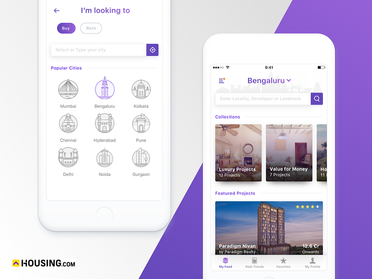
Daily UI Challenge #6
This is a minimalist revamp concept of one of the screens i saw https://dribbble.com/shots/2487370-City-Selection/attachments/487853 the idea was to change the heavy use of colors, as the use of colors is a lot imo & i wanted to make something that's minimal & also bears the same content weight. Here are my 2 cents! @Housing what do you think?
Please press "L" if you like it. Thanks for watching!
More by Ajit Pai View profile
Like
