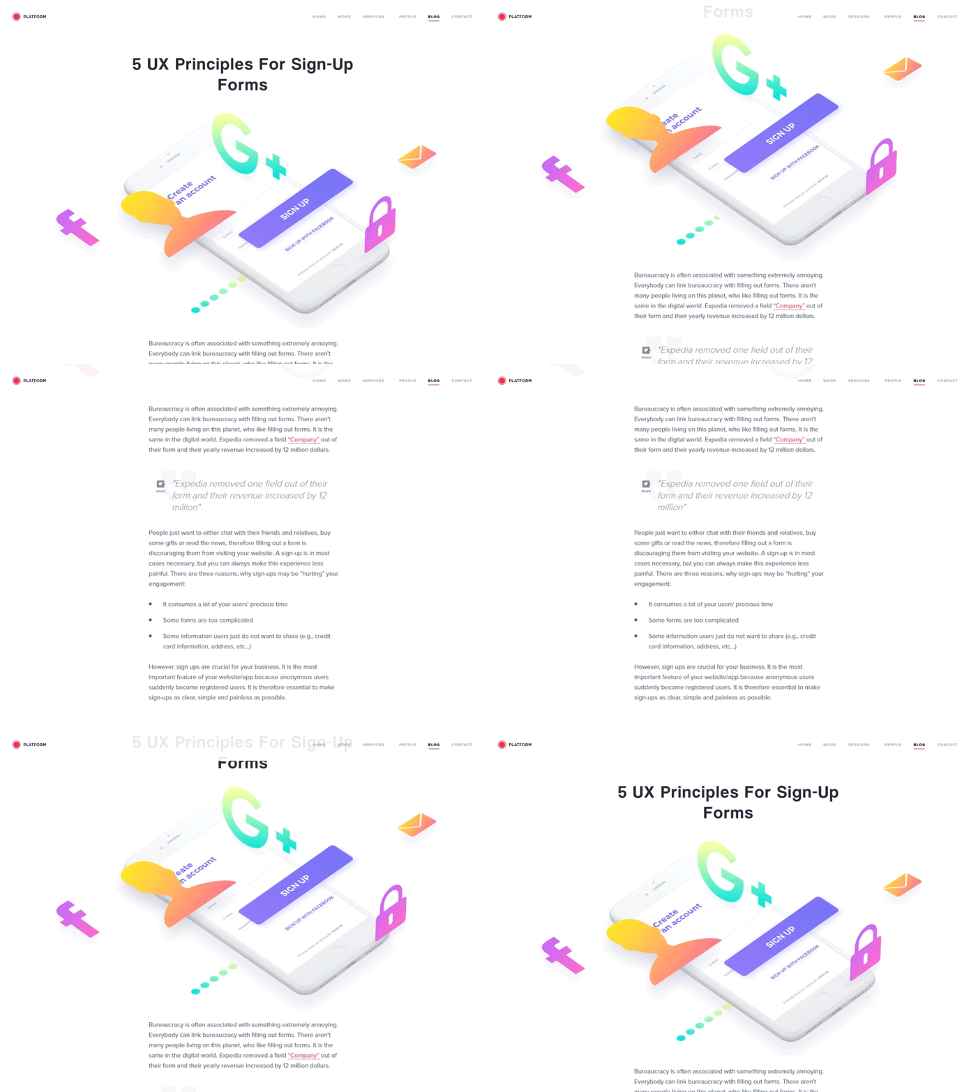
5 UX Principles For Sign-Up Forms
Expedia removed a field “Company” out of their form and their yearly revenue increased by 12 million dollars.
People don’t want to spend their time filling out a form on your website. However, a sign-up is crucial for your business and you should strive to make this experience less painful for your customers. It is the most important feature of your website/app because anonymous users suddenly become registered users. It is therefore essential to make sign-ups as clear, simple and painless as possible.
Read the latest blog post 5 UX Principles For Sign-Up Forms on our website.
Animation by @Lukáš Straňák
More by PLATFORM View profile
Like
