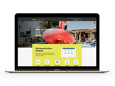
Sonnet Redesign
I was asked by Sonnet to create a whole new web identity and redesign their site. I used the foundation of three main colours, playful photos, and a simple, modular geometric card layout to create a much more distinct and recognizable brand identity.
See more at www.sonnet.ca and tell me what you think! :D
More by Zach Murphy View profile
Like
