Shaklee Cares Logo

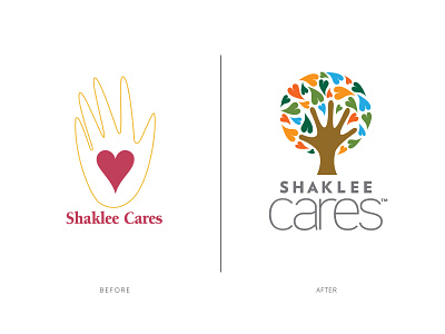
I was asked to redesign a logo for the company I worked for. Multi-colored hearts represent all people and love that is spread through help, and the hand represents direct involvement from Shaklee. Same basic concept, different take.
Good cause done by good people.