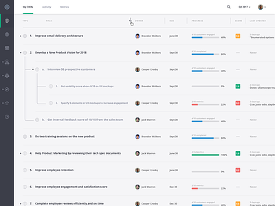
Nested table display
In a table that's already dense with data, how do you let users drill down further into each item while still maintaining a clear sense of hierarchy? I had a hard time figuring this out – displaying a lot of data is fine, and drilling down is fine, but trying to combine them was difficult. With so much content being shown, it's hard to make it clear which items have been expanded without squishing everything together so much that the data can't be easily understood.
After a bunch of iterations, this is what I came up with. Hope someone who's struggling with the same problem in the future might use it as inspiration!
More by Cooper Crosby View profile
Like

