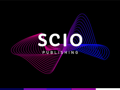
SCIO Publishing Selected Logo
The client wanted to push things even further into the abstract so I came up with this wavelength line mark that feels really futuristic and scientific. They wanted fuschia and blue specifically as no other companies in their field have these colors so finding legibility and a nice balance in the gradient was a design challenge for me. Ultimately, we decided this mark was great because they wanted to be able to use the wavelength as a design element on their collateral aside from the wordmark so it'll be fun to watch how this little guy comes alive.
More by Lauren Manuel View profile
Like
