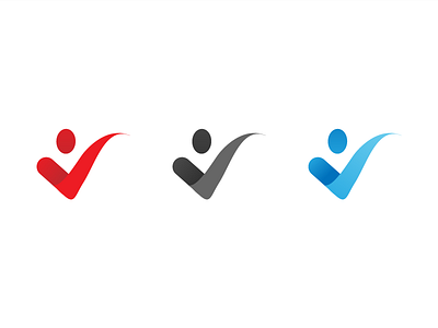
Logo Mark
Thank you @Alec Harrison for the invite!
For my first shot, I have a logo mark for a company called Benchmark undergoing a rebrand. We have three other designers working on various concepts, so I chose to embrace the company's desire to focus more on human connections and customizable packaging. The mark is a checkmark that speaks to the company name with a head to integrate that human aspect. The right arm of the mark is as unique as the company's package options.
Let me know what you think! Still in really early stages.
More by Kiona Highbridge View profile
Like
