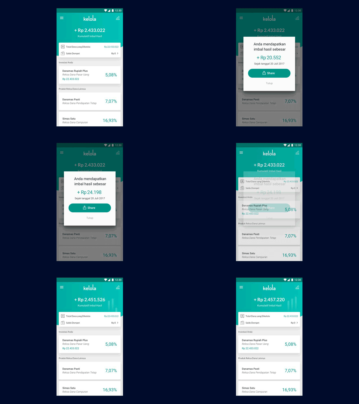
Kelola Growth Experience
Having fun with animation this week! This is an update to the previous mutual fund app. I was told by the stakeholders that they wanted to see growth graph in the homepage, but I think the homepage would be too crowded with the graph. So I went beyond the stakeholders' solution. Here is where the communication and bargaining skill needed. Instead of going straight to the suggested solution, I asked several questions to identify the problem and here is what I got:
Problem: User wanted to get more exciting experience on getting growth.
Solution: I animate the number growth and add the growing bar graph as a background while maintaining the homepage's simplicity.
Press 'L' if you like it :)
More by Emerentiana Meicy View profile
Like

