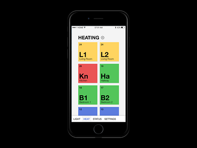
Daily UI #021 - Home Monitoring Dashboard
A glanceable dashboard.
I wanted something that would be immediately discernable. I find even Apple's own HomeKit to be too fussy and hard to grok, so I went with a periodic table-like experience, where the tiles were colour coded based on their status.
Any deviance from green indicates the heating/cooling system isn't performing as expected.
You'd be able to delve into the functions by tapping on the respective room/sensors.
More by Benjamin S. Leveritt View profile
Like
