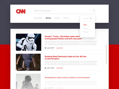
CNN Search
Third day of #ThirtyUI!
The task was to create a search page including some example results on a fictional CNN news page. I chose to use big thumbnails and just short excerpts of the article text, while having quite big headings and a minimal layout. Compared to the version that is online on CNN it is very very minimal, which might be more effective and comfortable, when scrolling some articles. Or what do you think? See you tomorrow! ⛹🏼
More by David Bielenberg View profile
Like
