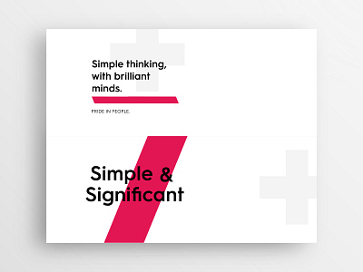
Type Exploration Cards - AAC
These are some typographic explorations I did for @Gravita to aid with the AAC rebrand. The aim was to incorporate the brand elements of the slash and plus symbol along with bold text and white space to create a simple and clear brand messaging. Pleased with these concepts and excited to share more work.
Let me know what you think!
The full project is live on Behance now if you want to check it out!
More by Daniel MacDonald View profile
Like
