Prawn
I've been working on my first true typeface for a few months now (check out my sketches of it: http://www.hipster.com/postcards/4e9606c2f8193a000100037d) and finally got around to making some substantial dents into the process.
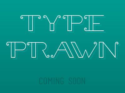
Prawn is a display typeface and you're looking at the "Light" weight in the shot. I'm hoping to provide at least a Light, Normal, Bold, and Filled! I still need to tweak and possibly redraw the 'C', 'G', 'O', and 'S' ... they are giving me such a hard time right now.
Thoughts? :)