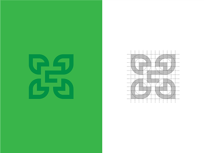
G For Garden
Hey guys, I'm working on a logo for a gardener and came up with this first proposal. I tried to include some leaves/flower and the letter "G" (negative). What do you guys think? Is the "G" obvious enough or too hard to read?
Happy to hear your thoughts!
More by Nick Luyckx View profile
Like
