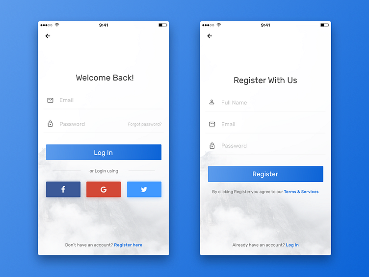
Daily UI Challenge #3
A simple approach to the mobile login/register page. Wanted to make something that is direct, something that doesn't leave the user guessing & to the point with a sense of minimalism to it. This is how it came out...
Please press "L" if you like it. Thanks for watching!
More by Ajit Pai View profile
Like
