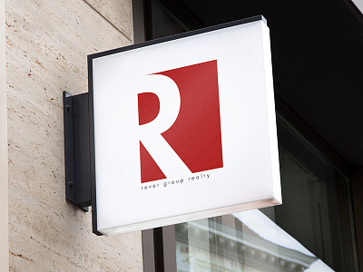
Rever Group Realty Logo
Daily Logo Challenge
Day 1.
A logo I designed as part of a Daily Logo Challenge, which I've been participating. This was the first logo that I designed for this challenge and began this project by looking at colors that other real estate companies were using. Red was a common color across many different major real estate companies (KW, ReMax, etc.) so I incorporated a similar shade into this design. The name was made up, but I liked using the letter "R" as negative space within a square. I tried other designs but ended up going with this one for its simplicity and ability to be easily recognized.
Any input or advice would be greatly appreciated.
More by Austin W. Duncan View profile
Like
