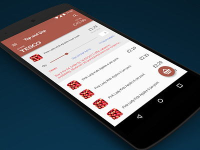
'Tap & Gap' App Concept
Tap & Gap is an app concept that I came up with for a UX Design challenge.
The challenge: Traditional retail has failed to adapt to the digital revolution, and customers are increasingly turning to online retailers due to a number of key advantages to the online shopping experience. However, many recent studies have shown that a majority of shoppers still overwhelmingly prefer to shop in-store than online. So how can we bridge the gap between the physical and digital shopping experience, creating a more streamlined and modern approach?
The solution: Tap & Gap is an app that allows you to browse through a shop physically, tap on the products you would like to purchase with your phone, and then order them directly to your house. Users have the benefit of browsing a store and deciding on what they want to purchase. an experience that is currently almost impossible to emulate online.
The app would use NFC tags attached to the back of shelf-edge price strips. I believe that the potential for NFC to bridge the physical and digital is still largely untapped, but with Apple reportedly opening up their NFC to third parties, it will hopefully open up the market.
In an ideal world (read: non-existent utopia), the app would be integrated with all large grocers, so a user would simply need to walk in-store, tap on the first item and the app would switch between shopping lists. This would resolve the current frustration of having to have a different app for each individual grocer, which just causes confusion and wastes shoppers' time.
Above is a high fidelity prototype that I created for the starting screen of the app.
PS. I take no responsibility for the scandalous name of the app.
