Rebranding B&H pt.2
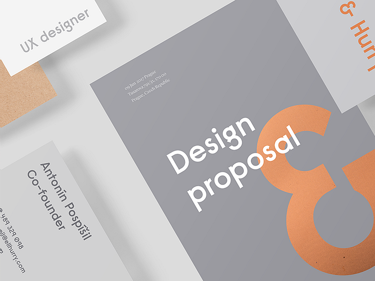
Another concept of B&H rebranding. This time with the material combination - metal bronze, natural paper, and shades of gray.
We already working on the final one right now but I want to share with you some fun that I had from this concept marathon💪
Next branding shot of B&H is going to be the final one. I promise.
Thank you and have a lovely Friday! Lucie
More by Bell & Hurry View profile
Like
