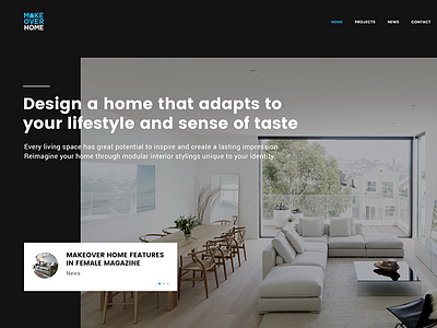
The Makeover landing


I always like to explore the different approach of layouts for landing page, yet still keeping its simplicity and aesthetic overall.
Usually we will make the concept screen image as big as possible or to take up full-screen. It's very common and dull in a way when you see it longer.
This layout has a big space on top and left, to make it more spacious and dynamic in terms of content and visual impact. With this approach, we can be playing around the content without any limitation. However, I'm still using grids to control it. Attached the grid's layout if you're interested.
L