Toro Loco 2012
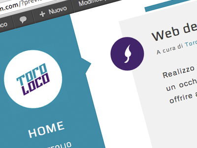
Here's a sneak peek of the complete rebrand I'll make. This is the homepage of my online portfolio and you can also see the new logo on the right and the lettering on the left.
I tweaked the colors of the previous shot just a tiny bit to make them darker.
The only thing that remains unchanged is the website's structure, since it's only a couple of months old.
Hope you like it!
More by Stefano Slomma View profile
Like
