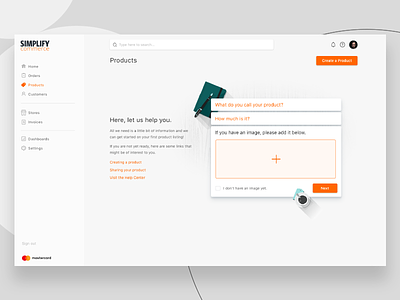
Empty State Concept
I want to make an empty state a little more useful than just adding some help links and minor instruction. A mini form that leaves off a large amount of detailed inputs (which aren't required) and just gets the merchant set up with the basics to get them over the hump might be a little more motivating.
Attached are the two different layouts. I think I prefer the right-aligned form, but I am open to suggestions.
(Illustrations are temporary placeholders)
More by Michael Forbis View profile
Like


