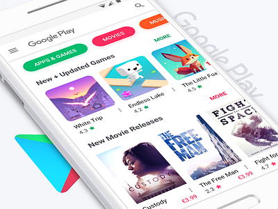
Google Play redesign (home screen)
Google Play home screen redesigned:
• Action bar has a standard approach instead of confusing integrated search bar.
• Store categories are clearly laid out.
• Larger product icons and larger text for better content perception and readability.
• Single background (no shadowed islands) and no border approach for simplicity and lightness feel.
Update: I'm glad Google agrees with me on some points - now categories are laid out the same way as in my v2 approach (Sept 17).
Update: Google agrees with me on the white action bar and a single background as well (Sept 18)
More by Vitaly Silkin View profile
Like


