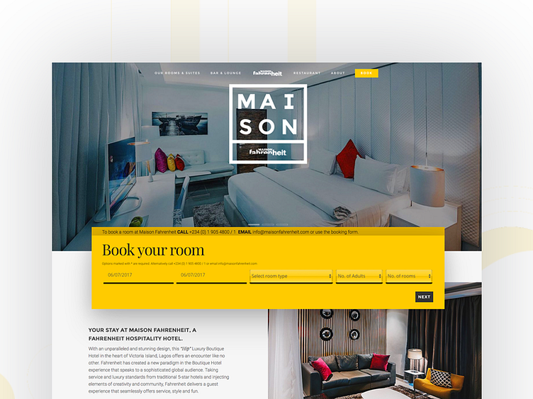
Maison Fahrenheit Hompage
The Hotel website that finally reflected the excellent craftmanship and attention to detail that the physical manifestation exudes. I brought forward many of the colours seen in the interiors and reduced them to four hues, a warming yellow, deep red, deep blue and Black. This was partly inspired by the the Netherlands-based De Stijl movement and Piet Mondrian's famous geometric peice featuring the aforementioned colours.
Being the designer and the developer I wasn't afraid to share this as a screen shot rather than the design only in order to be more open and transparant about my creation and its flaws. More specifically the last three dropdowns that I will eventually figure out how to style out the system default appearences in order to make them as flat as the other input boxes.
