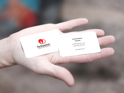
Forkassion
This is a rebrand of a food blog originated in Slovakia. The current logo design reflects what does the Forkassion brand stand for—'love for food' and 'love for travelling'. This was achieved by the combination of three elements: a map marker (pin), a heart, and a fork; and the red colour. The new logo is simple, fresh, and trendy.
I chose this particular colour scheme, because the red colour is mostly used for food-related companies, e.g. Coca-Cola, McDonald's, KFC, Kellogg's, Wendy's, and the list goes on. Colour psychology-wise, it leaves an impression of strength, energy, and excitement.
Logo font: Sofia Pro
Body font: Futura PT
--
Client: Forkassion (www.forkassion.com)
Location: Žilina, Slovakia
More by Erik Fiala View profile
Like

