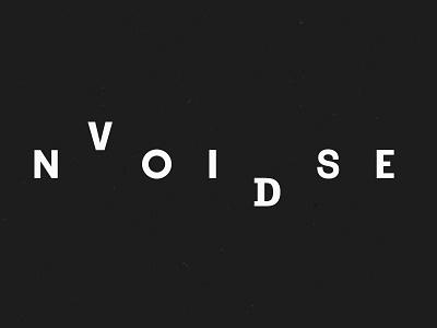
noise and void
Since I might relaunch this project soon, I worked on the Logotype again. I returned to the original, sorted concept, but tweaked the "D", the "S" and the spacing between the letters. This might be the final version. Thoughts?
However, I definitely need an additional square logo for the social media sites.
More by Lucas Rees View profile
Like

