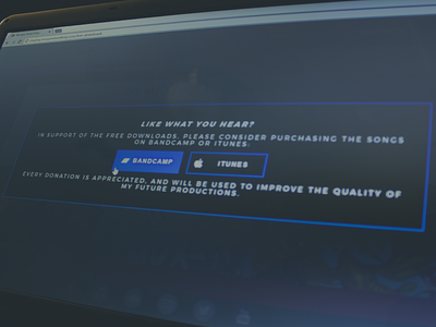
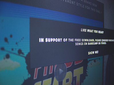
Dark Modal
Final version of a design I worked on for a model on the music page. We decided to go with a blue/slate visual style with clean square buttons.
Check out the attachment for some pixels. Please provide your feedback on UI/UX - I'd love to hear what you think!
More by Joey Gallegos View profile
Like


