UI Popup Overhaul
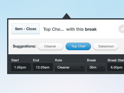
Getting the chance to refine one of the major UI elements for this app. The idea is to simplify it as much as possible as it is the most used action in the entire app. The blue button shows the hover state. Still not entirely happy with it but its getting closer!
More by Saxon Fletcher View profile
Like
