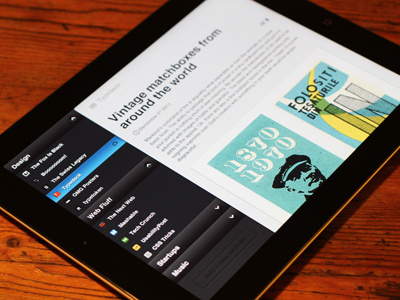
Reader App Idea in Full
A bit of a disclaimer first: This is not a client project, It's just an Idea I had and a bit of fun on my part over the holidays. I know there are already amazing feed reader apps out there but I'm a designer so once I have an idea I run with it. I'm not a hardcore feed junkie but I do vist the a lot of blogs and just skim over them. This is that behaviour in an iPad app.
The concept works on the same behaviours as the new Facebook/Path app interaction. Sections on the left and right with the main content covering them unless swiped (or tap the icon) to uncover them.
Left is all where you manage all your feeds, add new ones ect and the right area is where you can get to articles and posts you have bookmarked and want to read later.
A two finger swipe down on an the reading area would uncover the reading options. Day and night time reading mode, Sans Serif/Seif choice and text size.
Take a look at all the attachments.
So yeah...


