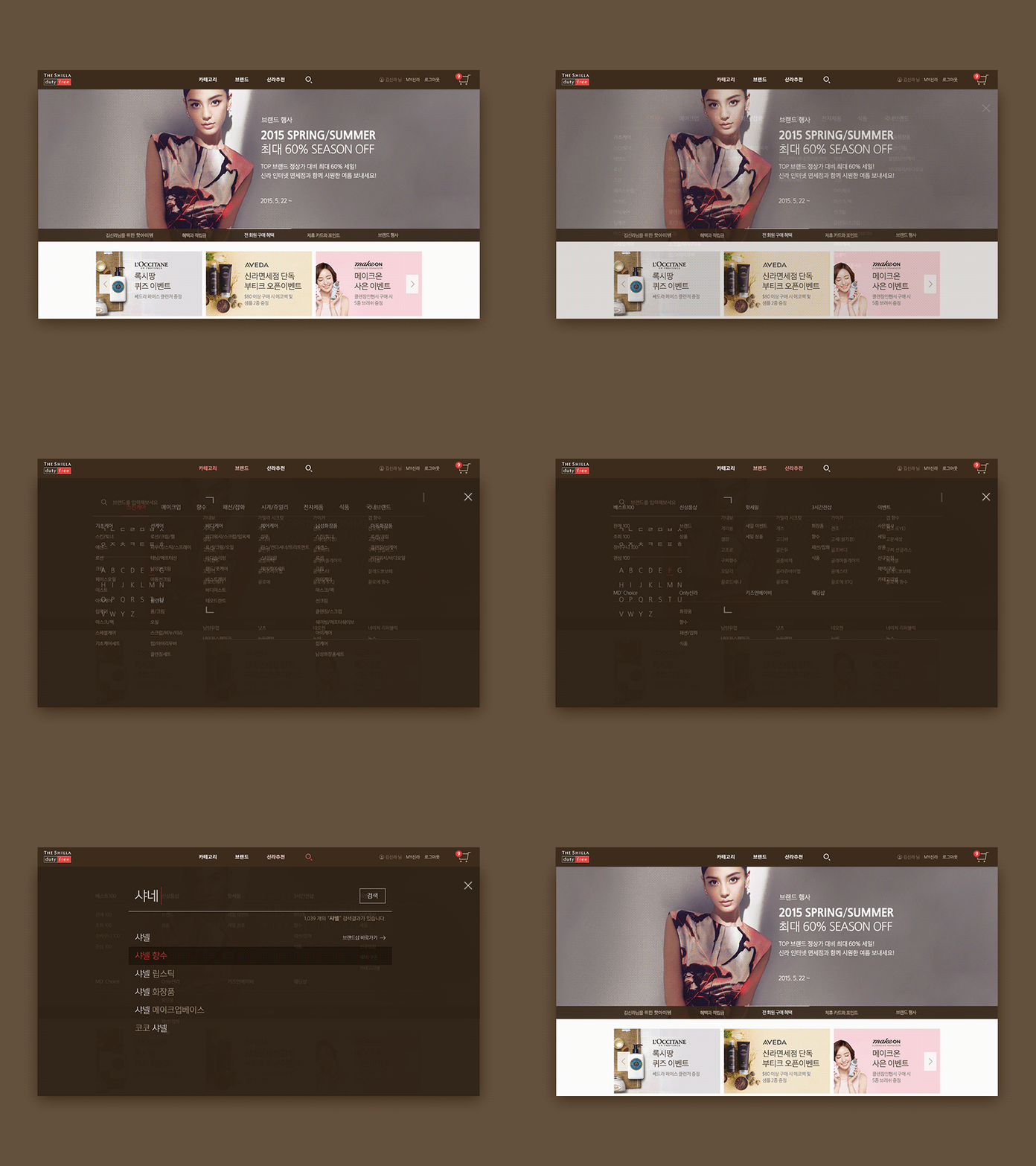
Navigation
Hello guys,
This shot was for a duty-free online store.
It's one of my old works which actually wasn't selected by clients. But I still believe it fits more their brand personality; Luxury.
Duty-free users have varied needs. Some looks for a Dior lipstick, some does just for discounted fragrance and so on. Therefore, the rule of thumb in UX was providing proper navigation to each user.
Navigation menu was defined as
- Departments
- Alphabetical brands list
- Recommended goods
- Search UI
(Plus, exploring contents on the main page for inspiration.)
And the UI was designed to deliver these navigating methods clearly and instantly.
More by Sinhwan Kim View profile
Like


