Craigslist Redesign Concept
Hello, guys!
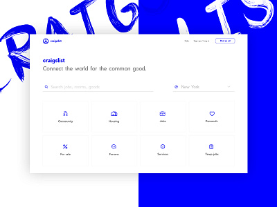
Imagine good old Craigslist would make a redesign. What could it be?
We asked ourselves the same question and now look what we’ve done.
The current Craigslist looks too overwhelmed, too heavy, too old school and outdated. So, we decided to breathe new life into it. We cleared the space to make it feel lighter and fresher. We left the same “hyperlink” blue color to make it bright enough.
The goal was to make such kind of service extremely easy-to-use, so users could achieve their aims in just a few clicks. We said “no” to the complicated interfaces, putting an accent on the most important parts of user experience.
You can also explore the full page as well.
Feel free to comment, share your thoughts and ideas of which service you’d like us to make a redesign concept next.
Don’t be shy to share your love with us.
Follow us:
https://www.facebook.com/esterdigital/
https://twitter.com/ester_digital/
hello@ester.co

